DATA PLAYBOOK California Health and Human Services Agency

Data changes everything
With over 33,000 employees, we at CHHS make up the largest agency under California’s executive branch. Our 13 departments collectively have access to an unprecedented amount of data – it is our mission to use this data to improve the programs and services we deliver to our clients, amplify the impact of the data reports we create, and to create an organizational culture that is focused on data-driven decision making.
What’s inside
This playbook is intended to help you with your data project from start to finish. Every member of CHHS – from the data novice to the data expert – will find something useful here, whether it’s learning how to analyze a dataset for the first time or refining your knowledge of advanced data visualization.
Inside, you will find four chapters:
| 1. Planning Your Data Project |
| - Setting goals and strategy - What data you will need - Identifying your Data Sources |
| 2. Analyzing Your Data |
| - Cleaning and De-Identifying Your Dataset - Learning Resources - Review: Facts, Stats and Trends |
| 3. Communicating Your Results |
| - Crafting your Data Narrative - Designing Effective Visualizations - Sharing your Findings with Others |
| 4. Concluding Your Project |
| - Product lifecycle & User Feedback - Product Design Strategies |
Additionally, we’ve created a Resource Library with a quick summary of all public data sources, skill building and training resources, and useful data analysis tools and software included in the playbook.
Our goals for this playbook
This playbook is a living, breathing document that will change and adapt based on our collective experiences. We highly encourage you to contribute to the resource library or share your data story – collaboration will be essential to shaping our organizational culture. It is our hope that each user of this playbook leaves feeling more empowered by the skills they’ve gained and inspired to bring about meaningful change.
If you need help accessing any of the materials in the Playbook, please contact dataplaybook@chhs.ca.gov.
Section 1: Planning for your Data Project
Table of Contents:
Part A. Determining Goals and Strategy
Part B. What Data you will Need
Part C. Where to Find the Data you Need
Taking the time to plan your project is essential. Whether you’re managing a team, analyzing or cleaning a portion of data, or drawing conclusions from your findings, completing any portion of the project requires a great deal of thought and planning. In the following section, we’ll provide a clear, step-by-step guide to the entire planning process, including everything you need to know about creating goals, determining a plan, and getting your data. It is our hope that you leave this section with a detailed and specific plan, and the confidence that you have the tools to carry out a successful project.
This section will:
- Help you identify the right questions and goals to guide your data collection process
- Describe what data you will need to successfully complete your project
- Provide helpful frameworks to jump-start your strategic planning process
| For Managers | For Analysts |
|---|---|
| - Setting Key Performance Indicators (KPIs) and measuring performance | - Getting the data you need — list of Useful contacts |
| - Assessing your department’s data organization and data strategy | - All things public data |
| - Assessing Readiness and Resources | - Review of Data Sharing Agreement and Simplifying Interdepartmental Access to Data |
Part A: Determining Goals and Strategy
Step 1: Identify your Guiding Questions and Set your Goals
It is important to decide your vision and purpose behind your project, and identify what you hope your data project will accomplish. Be thoughtful — what impact do you hope to have? What changes are you trying to bring about? It is worth taking the time to write down your answers to the broader Guiding Questions, as they will be the foundation of your goals and strategic plan.
First, a bit about goals: for your project to execute smoothly, it is best to choose SMART Goals, of goals that are specific, measurable, achievable, realistic, and timely. Look at our summary of the SMART Goal checklist below:

| Hint: Goals often fall into one of the following categories: |
|---|
| - Increase something (e.g. increase healthy behaviors in a population) |
| - Make something (e.g. produce a mapping/visualization of all COVID-19 cases across California) |
| - Improve something (e.g. improve living conditions of a population) |
| - Reduce something (e.g. reduce number of smokers in California) |
Step 2: Develop a Strategic Plan
Now that you have identified your goals, you must develop a strategy for achieving your desired outcomes. A Strategic Plan is first and foremost a Roadmap to Success – the more care and thought you put into your plan, the more likely you are to produce a successful data project.
| Did you know? |
|---|
| CHHS has its own Strategic Plan that summarizes our vision and goals for every department’s products and services. While not a substitute for your strategic plan, it can give you ideas and and helps you ensure your strategy aligns with CHHS’ guiding principles and mission statement. |
Utilize a strategic planning framework such as the use case diagram or a logic model. These frameworks will help you explicitly define each step necessary to achieve your goals as well as anticipate what challenges you may face throughout your project.
Strategy Tip: Find the action words that best describe the work you’ll do:
Action words are verbs that describe how you will approach each task in this project. They don’t describe your intended outcome (i.e. increase and reduce are not action words); rather, they describe roles you will take throughout your project to assure a successful outcome.
If you are creating a product:
- Update, Upgrade, Develop, Create, Implement, Evaluate, Produce If you are managing a project:
- Oversee, coordinate, supervise, manage, plan, support, transition If you are implementing the specifics of a project:
- Write, process, provide, maintain, reconcile, direct, administer
 Example Use Case Diagram (lucidchart.com)
The Use Case Diagram
This framework is most helpful for projects where you intend to build some sort of system (e.g. website, smart phone app, etc.) that your users must interact with. You also must use a Business Use Case for any data you request using the Data Sharing Agreement form.
A Use Case Diagram will…
- Identify the goals of system-user interactions
- Define and organize functional requirements in your system
- Specify the context and requirements of a system
- Model the basic flow of events in a use case
Instructions for building a Use Case Diagram:
| Step 1: Start by defining your actors, or the users that interact with your system. they can be anything from a person to an organization or outside system that interacts with your product. Note: Think broadly – your users may include institutions both within and outside of CHHS as well as specific populations of the public |
| Step 2: For each user, list all the ways they can interact with your system (these are the “use cases”) Note: Ensure you consider alternate/undesirable courses of events and use cases that aren’t obvious |
| Step 3: Draw lines between use cases to reflect commonalities or relationships among them. Note: Identify the use case with the greatest number of relationships/associations – the most common use cases represent the functions in your project that should be essential. |
Also check out this Online resource to build your own Use Case Diagram.
The Logic Model
The logic model framework focuses on visualizing the relationship between inputs, outcomes, and costs associated with your project. It is a graphical model where each component (or “phase”) of your project relates to a list of intended effects in an implicit, ‘if-then’ way.

| The seven “components” you’ll consider are: |
|---|
| 1. Inputs: The resources you need for your project |
| 2. Activities: What the staff or the program does with those resources |
| 3. Outputs: Tangible products, capacities, or deliverables that result from the activities |
| 4. Outcomes: Changes that occur in other people or conditions because of the activities and outputs |
| 5. Impacts: The most distal/long-term outcomes |
| 6. Assumptions: Your beliefs about the program and the resources involved (including how successful you you think it will be or the challenges you may face) |
| 7. Moderators: Contextual factors that are out of control of the program but may help or hinder your efforts. These may influence participation, implementation, achievement of your outcomes. |
Example: e.g. If I hire more staff for my project (input), then I can collect more data about who would benefit from my service (activity). If we have more data, then our predictive model will be more accurate (output). If our model is more accurate, then we can increase outreach to populations who are more likely to benefit from our service (outcome) and so on.
To begin, simply create six headers as is shown in the diagram above — this can be done by hand, with sticky notes, or online.
Guiding Questions:
- Identifying Impact: What measurable change are you seeking to achieve in the long-term?
- Identifying Outcomes: What measurable changes are you seeking to achieve in the short-term?
- Identifying Outputs: What tangible outcomes can you measure immediately following the implementation of your product/project?
- Identifying Activities: What are some high-level steps you must take to complete your project?
List everything that comes to mind when you answer the those guiding questions above, drawing a box around each entry. Finally, draw arrows between boxes to signify the ‘if-then’ relationship.
 A Sample Logic Model from CDC.gov
Planning Part B: What Data You Will Need
With your goals and strategy successfully outlined, you can now think about what data or measurements you need to collect to answer your guiding questions, as well as the data you need to determine if you are ready to proceed with data collection. If you’re a manager, you’ll also need to define your outcome measures and performance/self-assessment metrics to maintain the integrity of your project and ensure you’re supporting your team and stakeholders as best you can.
For Analysts
Before proceeding, you should go through a Readiness Checklist to ensure you’ve considered your own strengths, weaknesses, and that of your manager and team. Get the support or learning you need now to prevent misunderstandings or frustrations later in the process.
Step 1: Readiness Checklist
Ask yourself: Do you have the Support, Knowledge, and Resources to Complete your Project?
| - Do my managers/directors have the bandwidth to support me? |
| - Do I/my team have enough expertise to complete this project? |
| - Do I have access to the data I need to complete the project? |
| - Do I know the statistical methods required to analyze my data? |
| - Who is my department’s Data Coordinator? (The individual responsible for knowing the data assets held by your department) - Contact CHHS@osi.ca.gov to find your Departments Data Coordinator |
Step 2: Review Your Program Data
Your program data is the core data of this project — it’s the specific measurements that you need to collect in order to answer the project’s guiding questions. As a review, your guiding questions are the purpose of this project as a whole, and spending some time thinking about your project’s purpose statements will help you determine what data you need and how you should collect it.
Example Purpose Statements:
- I need to decide how to allocate resources to different programs based on which is the most successful
- I want to improve or refine an existing program or model to be more effective
- I want to create product or service that positively impacts a community
- I want to look at existing data to find trends and patterns that people care about
It can be useful to review all your data assets with these questions in mind. Contact your department’s data coordinator for more information about the types of program data you collect in your department by emailing CHHS@osi.ca.gov.
For Managers:
Managing a team at CHHS is challenging — in addition to setting and working toward your program goals, you must also assess the performance of your team and support their continuing learning; set the broader goals that guide larger initiatives, programs, or departments; and work toward capacity building in analytics, data literacy/governance, and much more.
The following section is written for a wide range of manager roles, including the larger cohort of managers who supervise analysts and technical employees (SSM1s) to the smaller cohort of branch-level directors or managers working on capacity, vision, and strategy of their department.
Part 1: Assessing Capability
As a manager, you may be in charge of managing the overall performance and strategy of the project or program; you also may need to assess the performance of the team itself, and the department’s resources. This requires defining and measuring outcome data, monitoring your team’s or program’s performance, and assessing your department’s current data assets and analytic capabilities.
| The following section contains a number of frameworks and resources to assess your Team’s Capabilities… |
|---|
| …related to projects and programs |
| - Assessing Readiness: considering the scope, risks, limitations of your data project - Measuring Performance: Setting Key Performance Indicators (KPIs) for the project and your team - Determining Outcome Measures: benchmark, baseline, and comparative data |
| …at the department level |
| - Strategic Use of Data: how effectively does the department utilize data to inform decisions and strategy? - Capacity Building: Improving internal capacity, assessing management strategy & organization - Data Governance & Management: Management & Security of Data, Improving Data Literacy, data de-identification guidelines |
Managers of Projects and Programs: Assessing Readiness
Before planning your data collection, go through the following readiness checklist to ensure you are capable of successfully carrying out this data project. You should catalog your assets and resources regularly throughout your project to identify areas of weakness or gaps in resources.
The Readiness Checklist:
- How do programs or stakeholders use data currently? What do they do with it? How do they use it to make decisions or produce products for external stakeholders?
- What are limits to either the data or the implementation solution?
- What are the risks and issues with the current data? What value is not being realized?
- Identify the current workflow for collecting, processing, and publishing data. Are there dependencies to collecting, processing, and publishing the data?
Remember, if you do not have the resources you need, you and your team will likely encounter problems in your data project. Address weaknesses early and be on the lookout for areas you can improve throughout your project.
Measuring Performance and Outcome
This is the data you need to collect after deploying your product or service to determine whether or not it met your goals and was successful. A useful framework to reference is the Key Performance Indicators (KPIs) framework described here. KPIs measure your performance relative to your goals.
- Check out this resource to learn all about KPIs: what they are, why they work, and how to set them effectively.
Managers of Departments: Strategic Use of Data
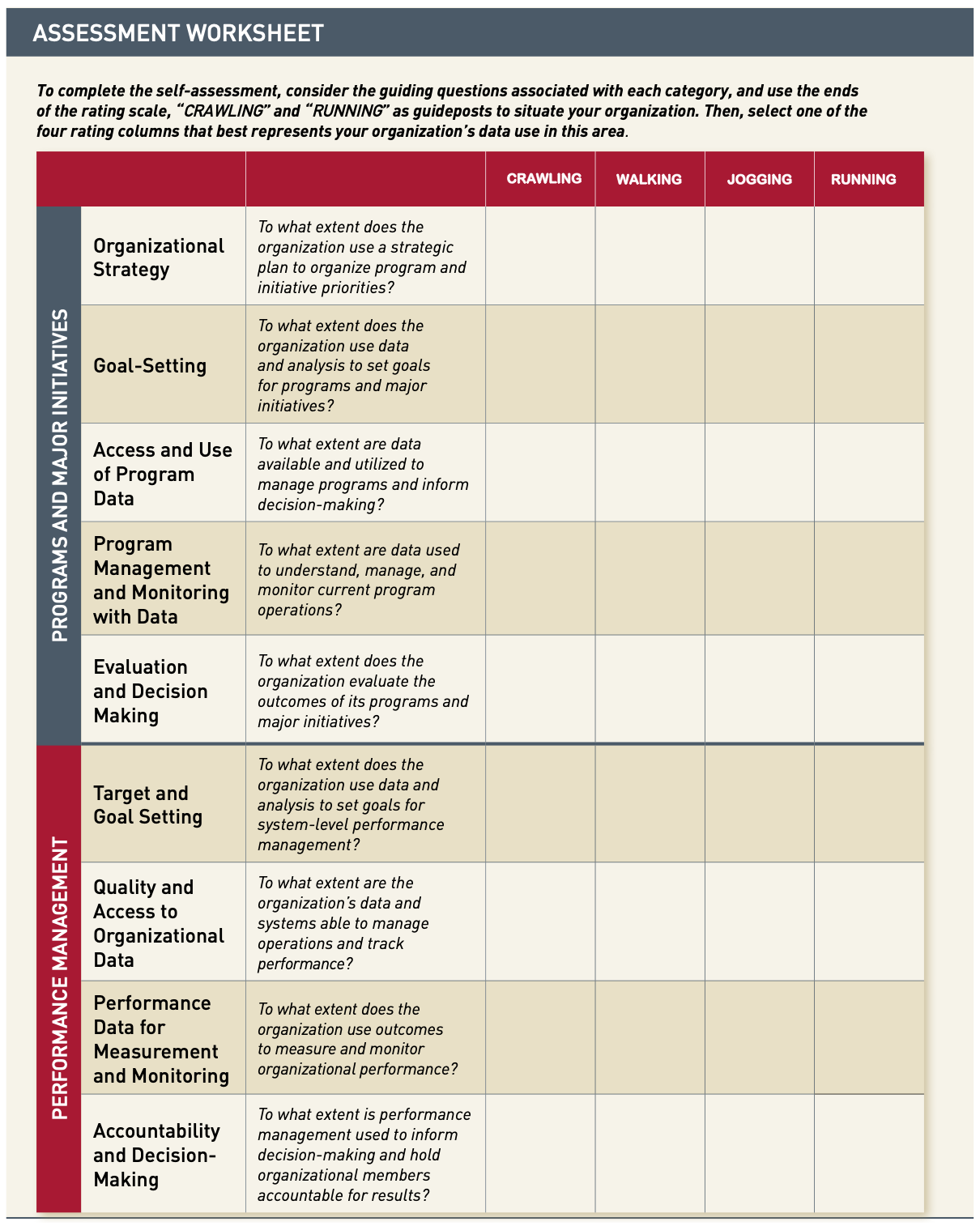
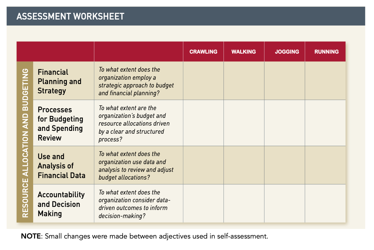
It is imperative for managers to regularly assess and improve how effectively they use their data assets to inform their strategic planning and organizational structure, as well as improve their offered programs and services. We will root our assessment in Harvard’s Strategic Use of Data Self-Assessment Guide, a useful framework for understanding how strategically your department uses data and how to improve. A few examples from the guide:
- Effective Budgeting and Financial Planning practices driven by data
- Assessing organizational strategy and goal-setting
- Measuring accountability at all levels of your team
Building Analytic Capacity
For managers interested in these types of assessments, check out additional resources on building Capability and Capacity in your department (such as the Analytics Capability Assessment for Human Service Agencies.
Note: For more concrete recommendations to build analytic capacity, check out this Roadmap to Capacity Building in Analytics. It will cover:
- All staff/Human Resource Needs for a successful team
- Executing a successful Program or Initiative
- How to integrate best practices in Data Governance
- Training Resource Topics to Provide to Analysts (Data Processing Methods)
You may also be tasked with assessing the quality of your department’s data management and data governance, or working on capacity-building frameworks to improve data literacy and analysis skills.
Harvard’s Strategic Use of Data Self-Assessment Guide has specific questions to identify where departments can better use data at the organizational and strategic level
 Harvard’s Strategic Use of Data Self-Assessment Guide has specific questions to identify where departments can better use data at the organizational and strategic level
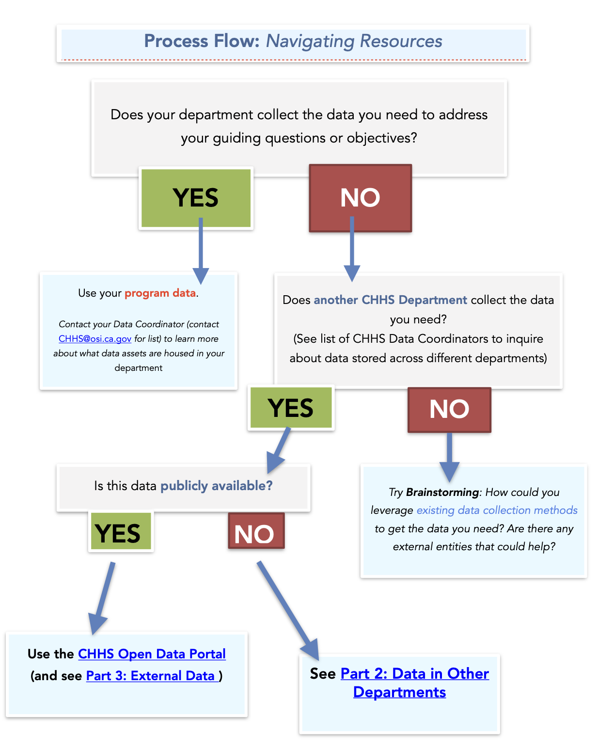
Part C: Where to find your data
The final step of the planning process is also the most important and crucial to successful execution of your project: determining what data you need and where you will find it. This step can be time-consuming and frustrating, but the effort you put in will pay itself back ten-fold when you find yourself sitting down to start data analysis. Accurate, validated, and comprehensive data is the cornerstone to any data-driven initiative. It is critical to prioritize reliability and integrity of the data in order to ensure the legitimacy of your findings. In most data-driven companies, the “80/20 Rule” applies to data projects: 80 percent of your work will be spent finding, retrieving, cleaning, and organizing your data, and only 20 percent spent on actual data analysis. So don’t be surprised if this process seems daunting, and don’t rush through it. In this section, you’ll find information on accessing Internal Data (both within your department and in others) as well as External Data (data owned by some outside agency/organization, and typically publicly available). Use the Process Flow Chart on the following page to choose which resource — the Data Sharing Agreement, the Open Data Portal, your department’s stored data, or publicly available data— is appropriate for each of your data sources.
Option 1: Program Data
In most cases, you’ll be working with your Program Data — data that is owned by your department and collected by or for your program. This data resides within your department, and is easily accessible through your department’s Data Coordinator, who is your first resource to seek out when you need help thinking of what data to source for your project or where to find it. Please email CHHS@osi.ca.gov for help with contacting your department’s data coordinator.
Option 2: Data in Other Departments
In a few cases, you may find that your department does not have enough data for you to proceed with data analysis. To ensure you have a sufficient amount of data to begin your analysis, you are encouraged to look to other departments’ data assets and determine if they’d be appropriate for your project.
Your first step to finding data in other departments is to check the CHHS Open Data Portal, our database for all CHHS data that is publicly-available.
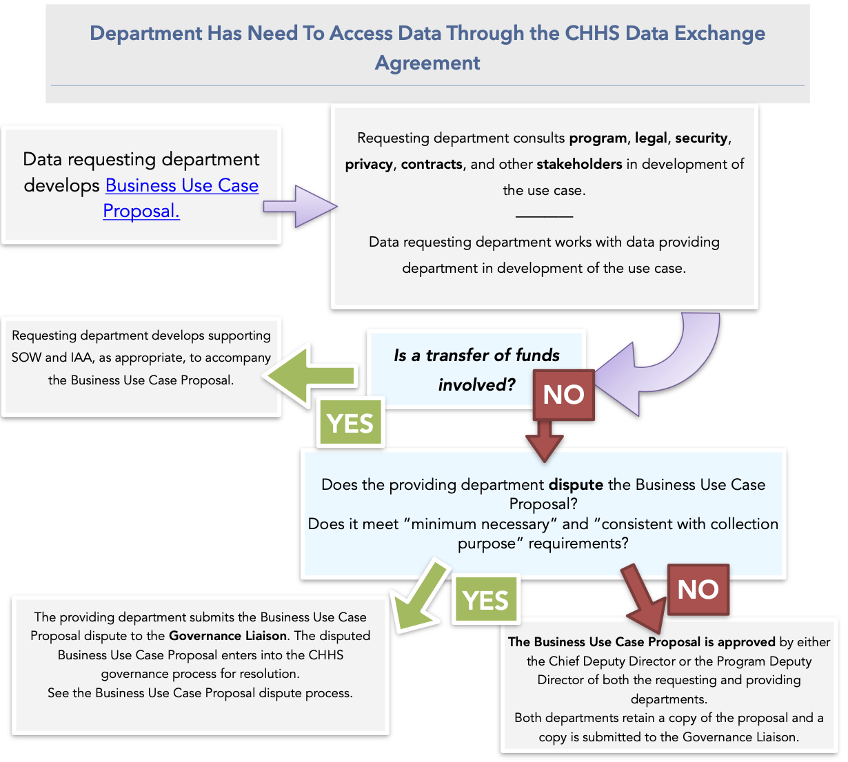
Data Sharing Agreement:
Accessing private data in other departments is dictated by the CHHS Data Sharing Agreement, a legal document that entitles the departments under CHHS to access the other CHHS department’s data assets through a Business Use Case Proposal. Only proceed with this section if you’ve (1) decided that some of the data you need is not already available through your department and (2) is NOT found on the Open Data Portal, then this is your next step.
Note: Read the Data De-Identification Guidelines (in Section 2, Part 1: Cleaning/De-Identifying your Dataset) before sharing any data from your department.
The goals of the Data Sharing Agreement are the following:
- Establish a legal framework for data initiatives
- Maximize appropriate sharing to increase positive outcomes and customer service
- Ensure privacy and security protections
- Reduce risk and use of duplicative resources
- Standardize data use agreements among CHHS Departments and offices
- Reduce contracting and data use agreement redundancies
- Track activity for better understanding of common data sharing needs between CHHS departments
To get data via the Data Sharing Agreement, you must contact your department’s Data Coordinator and submit a Business Use Case Proposal; this ensures proper documentation of what data you need, why you need it, and your commitment to several requirements, such as preserving the shared dataset in the form it was given to you. For more detailed instructions, visit the Business Use Case instructions or view the FAQ.
Option 3: Externally (Publicly-Available Data)
In the past decade, public interest in big data and data-driven projects has skyrocketed. As a result, there is a wealth of data available for free that may help you contextualize your results, find baseline measurements, or contribute to your findings. This section showcases some of our favorite sources of publicly available data.
- USAFacts.org — A data-driven portrait of the American population, our government’s finances, and government’s impact on society that uses federal, state, and local data from over 70 sources.
- datacatalogs.org — DataCatalogs.org aims to be the most comprehensive list of open data catalogs in the world. It is curated by a group of leading open data experts from around the world - including representatives from local, regional and national governments, international organizations such as the World Bank, and numerous NGOs.
- HealthData.gov — Dedicated to making high value health data more accessible to entrepreneurs, researchers, and policy makers in the hopes of better health outcomes for all.
- LOGD Dataset Catalog — The Linking Open Government Data (LOGD) project investigates opening and linking government data using Semantic web technologies. We are translating government-related datasets into RDF, linking them to the Web of Data and providing demos and tutorials on mashing up and consuming linked government data.
- CIA World Fact Book — Provides information on the history, people, government, economy, geography, communications, transportation, military, and transnational issues for 267 world entities.
- openFDA — Makes it easier to get access to publicly available FDA data. FDA’s goal is to make it simple for an application, mobile device, web developer, or researcher to use data from the FDA.
- Census Reporter — A Knight News Challenge-funded project to make it easier for journalists to write stories using information from the U.S. Census bureau. Place profiles and comparison pages provide a friendly interface for navigating data, including visualizations for a more useful first look.
- CalEnviro Screen — A mapping tool that helps identify California communities that are most affected by many sources of pollution, and where people are often especially vulnerable to pollution’s effects.
- California Healthy Places Index — A tool to explore community conditions that predict life expectancy. It contains user-friendly mapping and data resources at the census tract level across California.
- CHHS Open Data Portal — Offers access to standardized data that can be easily retrieved, combined, downloaded, sorted, searched, analyzed, redistributed and re-used by individuals, business, researchers, journalists, developers, and government to process, trend, and innovate.
Section 2: Analyzing Your Data
Table of Contents
Part A: Cleaning your Dataset
Part B: Learning Resources
Part C: Review — Facts, Stats, and Trends
Part A: Cleaning & De-Identifying your Dataset
A dataset that has duplicate entries or misspelled words can skew your outcomes. Check out Microsoft Office’s Top Ten Ways to Clean your Data before starting your analysis.
CHHS Data De-Identification Guidelines
Every single employee of CHHS — whether working with data in a technical capacity, as a manager, an analyst, or otherwise – is responsible for ensuring no personal or confidential information is ever shared throughout their project. The De-Identification Guidelines will walk you through this process.
As Departments classify data tables and catalog their publishable state data, they should be mindful of legal and policy restrictions on publication of certain kinds of data. The CHHS Data Subcommittee put together the following guidelines to ensure a standard of data governance across CHHS.
 The CHHS Data De-Identification Guidelines support CHHS governance goals to reduce inconsistency of practices across Departments, align standards used across Departments, facilitate the release of useful data to the public, promote transparency of state government, and support other CHHS initiatives, such as the CHHS Open Data Portal.
See the full guidelines here.
The CHHS Data De-Identification Guidelines support CHHS governance goals to reduce inconsistency of practices across Departments, align standards used across Departments, facilitate the release of useful data to the public, promote transparency of state government, and support other CHHS initiatives, such as the CHHS Open Data Portal.
See the full guidelines here.
De-Identification Considerations:
- The CHHS Data De-Identification Guidelines are the default policy for CHHS departments. If a CHHS Department wants to customize the guidelines, it must have appropriate references to departmental processes and must file a copy of their guidelines with the Office of the Agency Information Office.
- While most state agencies are covered by the California Information Practices Act (IPA), some are also covered by or impacted by HIPAA, the United States Health Insurance Portability and Accountability Act. Unlike the IPA, which applies to all personal information, HIPAA only applies to certain health or healthcare-related information. HIPAA requirements apply in combination with IPA requirements.
- For Departments covered by HIPAA, de-identification must meet the HIPAA standard. The CHHS Data De-Identification Guidelines serve as a tool to make and document an expert determination consistent with the HIPAA standard.
Part B: Learning Resources
Learning Resources
If you don’t have much experience with data analysis, it may be helpful to review some of the key concepts in statistics and math to make sure you understand what you are actually looking at during data analysis.
Other Resources:
- Coursera almost always has free online classes for new or experienced data analysts
- Khan Academy is one of the most popular online learning tools if you have more specific questions about data analysis.
- Lynda has a number of Tableau Learning Tutorials
Part C: Review — Facts, Stats, and Trends
Data analysis can be daunting for the first-time data analyst. To simplify the vast work of data science, we’ll stick to the “facts-stats-trends” framework:
- Facts are counts, sums, and numbers.
- Stats are basic descriptive statistics (mean, median, mode, distribution)
- Trends are found by comparing data between two points in time or groups (e.g. percent change, percent different)
- You can compare across time in the same group (longitudinal), or between groups in the same time period (cross-sectional)
Facts
Facts are useful for providing a high-level summary of your data or methods. (e.g. How many participants completed your program? What was the average calorie intake of participants at 4 weeks?)
- Facts can contextualize your data as percentages, fractions, or rates (e.g. 100 participants completed the program out of 150 = 67% completion rate)
- If you ever had benchmark measurements or metrics to set a baseline for your data, you can compare facts with those to assess whether some intervention was successful. (E.g. Only 80/150 participants completed the program prior to our change in outreach. Thus, we increased completion by nearly 14% through this project.)
Stats
Gathering meaningful statistics about your data is essential to gaining a deeper understanding into the impacts it had on your users. Even basic statistical transformations can reveal surprising patterns in your data.
- Simply put, stats present high-level summaries and suggest implications of your data
- Often the basis of simple charts and tables
- Central Tendency is one simple but powerful statistical measure
- Mean, median, and mode are all measures of central tendency — that is, how each data point relates to the average
- Excel can calculate this for you
- It can be useful to compare the central tendency of different populations in your study (Example: did individuals who completed your program experience fewer days of unemployment on average than those who did not complete the program?)
- The Distribution of your dataset — or how each data point relates to the set as a whole — can tell you a lot about your data through visualizations or graphs
- You can easily mistake a skewed dataset for a positive/negative outcome if you only rely on central tendency (e.g. out of 100 participants who completed the program, one reported 300 days of unemployment compared to an average of 14-20 days for the remaining 99. Since the 50 who did not complete the program experienced an average of 20-30 days of unemployment, you underestimated the effectiveness of your program due to the presence of this outlier.)
Trends
Trends are what result when you combine your facts with your stats — they reveal broader patterns that describe your program’s impact and answer your guiding questions.
Some examples trends and how to find them:
- Compare the average rate of completion of your project over time (How many participants completed your program on average at three different timepoints?)
- How did the percent of people who reported high satisfaction with the program change over time? (Was the percentage higher in at one time? Why?)
- Was one group more likely to experience unemployment one year after completion than another?
Note: When comparing distributions or central tendencies between two populations over time, you must prove any differences are statistically significant — that is, it is more than 95% likely that the differences you found between populations is actually due to your intervention and not to random chance. You can do this using something called a t-test. Read more about statistical significance here.
Section 3: Communicating Your Results
Table of Contents
Part A: Crafting your data narrative
Part B: Designing Effective Visualizations
Part C: Sharing with Others
Part A: Crafting your data narrative
Sharing your findings with the world is just like telling any good story — sometimes it’s more about the storyteller than the story itself.
All too often, truly meaningful and interesting data projects fall through the cracks because they lack a cohesive narrative or don’t convince the audience why they should care. Remember, it’s up to you to decide how to best leverage your data to tell your story in a way that is compelling, interesting, and true to you. Here are some guiding questions to get you started:
Who is your audience?
Your data story can and should change based on your intended audience. The contextualizing information you provide, anecdotes you share, or images you include in a professional journal would be completely different from those you’d choose to share to a group of high school science students. Consider the following questions:
- What is your relationship to your audience?
- Are you their peer? Did you used to be in their shoes? Do you have anything in common?
- What can you do to understand your audience?
- Create an audience profile for one of your readers/users
- Have you interviewed them? Learned their likes/dislikes?
- What is your ideal medium?
- Your ideal medium is the format through which you implement your product or disseminate your findings, such as:
- Digital (web, smart phone applications, social media, etc.)
- Formal Print (reports, conferences, PowerPoint/Keynote presentations)
- Informal Print (staff meetings, flyers, etc.)
- Video
- What do you want them to take away?
- Is your purpose to share something generally exciting (informational) or do your results inform a specific decision or action (decisional)?
- If informational: highlight the findings that are most shocking/interesting to you and your audience
- If decisional: present the findings in a way that obviously supports some change or recommendation
- This often requires you to contextualize your information — what else should your audience know to reach your conclusion?
| General Tips |
|---|
| - Use a word editing app like Hemingway to improve the readability of your writing - Hemingway will highlight lengthy or run-on sentences, remove overly dense writing, offer alternatives for weak adverbs and phrases as well as poor formatting choices. |
| - Connect to your audience emotionally — how can you make this more personal? |
| - Visualize your story with a storyboard (see MIT’s guide to finding a story in your data) |
| - Find the right balance between words/explanation and figures/tables/images - This will largely depend on who your intended audience is and what medium you are using — digital products should be more visual while reports or prints should rely more on words |
| - Similarly, balance your quantitative data with qualitative data — too much dry facts or too many numbers may work against a compelling data story - Anecdotes, stories, and contextualizing comments also count |
| - Start with your ultimate goal: What message do you want the audience to walk away with? |
Part B: Designing Effective Visualizations
Finding the ‘best’ way to visualize your data takes time and experience — if you’re a beginner, focus your efforts on learning from others and refining your methods to master the art of translating data to diagrams.
| If you just need a quick chart or table, check out these online tools — they are simpler to use than the advanced data visualization guides and may be more appropriate for your specific project: |
| - Google Charts (interactive charts & simple data tools) - DataWrapper (charts, tables, and maps) - Infogram (beginner-friendly, collaborative, focuses on design thinking principles) |
For more complex data projects, choosing the right visualization is more than just deciding between a pie chart vs. a bar graph — it’s about understanding your audience’s learning style and design preferences, leaning in to your creative side, and asking for lots of feedback.
Here are some resources to help you understand all types of data visualization, how to create them, and which choices are most appropriate for your data:
- Beginner: This article summarizing general Data Visualization strategies and common methods used in different professions and sectors
- Beginner: Tableau’s Data Visualization for Beginners: a Definition & Learning Guide with helpful examples
- Beginner: This Step-by-Step Guide to Data Visualization and Design written for beginners
- Beginner-Intermediate: Kaggle’s Data Visualization Course teaches you how to implement some more basic, powerful data visualization techniques (line charts, scatter plots, and distributions) and how to choose the right one
- Intermediate-Advanced: The Data Visualization Catalogue has a comprehensive list of charts that are separated by what data visualization function they employ
- All levels: Coursera often has free online Data Visualization Courses — check to see if one is available!
Part C: Sharing with Others
Getting your message out there requires you to actively share and distribute what you discovered or created.
Important Note: While it may seem as if we believe success is a necessary requirement to any “good” data project, this could not be further from the truth. No data scientists is free from failure, and data projects with less-than-ideal or confusing outcomes — besides being incredibly common — are immeasurably valuable to share with others. As a community, we will never learn from each other’s experiences if we do not communicate our failures.
Building the Data Community at CHHS
Across the agency, there are a few existing groups and initiatives that exist to help you leverage your department’s resources to publicize your findings. Take advantage of the resources available to you, ask for help from those who’ve done this before, and be proud of yourself for completing your project!
- There are a number of “Data Showcase Teams” across the agency. They organize events to build a shared understanding of data, celebrate successes and failures, and learn from each other’s projects.
- Your department or program may have an established visual and brand style that provides credibility to your data analysis, thus increasing its chances of publication. These styles standardize color themes, fonts, and citation formats across agency publications.
- A repository of CHHS data assets is currently underway to streamline creation, maintenance, and sharing of each department’s resources.
Section 4: Concluding Your Project
Table of Contents
Part A: From Data Projects to Data Products
Part B: The Product Lifecycle
Part C: Automating the Maintenance of Your Dataset
Part D: Retrieving and Implementing User Feedback
Part A: From Data Projects to Data Products
Until now, we’ve used the words “data product” and “data project” interchangeably, but the two concepts are worth differentiating before this section. A project might come to mind when you think of any enterprise or initiative related to engineering, science, and data, such as building a bridge or conducting a research study. A product is more often associated with business, markets, and consumer satisfaction. Projects have a short-term scope (i.e. a set start and end-date), are meticulously planned through use of budgets, schedules, and deadlines, and are comprised of a team of technical experts (such as engineers, physicists, mathematicians, etc). They are intended to deliver an output timely, safely, and effectively.
Products are different from projects mostly because they have a circular lifecycle — that is, a “product” never ends. This is because a product is anything intended to meet some need of the customer, which is often a moving target that morphs and changes over time. Where projects are concerned with budgets and schedules, products rely on markets, customers, and trends, and require a team of flexible, creative, and intuitive individuals to effectively understand how to address the needs of the customer. Since projects are so narrow in scope, they are often left unmaintained and unmanaged after completion. This is a huge waste of the time and resources that went into that project: what lessons did they learn? How could their strategy be utilized elsewhere? Even small efforts toward maintaining your project — such as getting stakeholder feedback every six months — transform your project’s impact. What’s more, the product mindset can teach you to be adaptable, flexible, and creative; three skills necessary to building longer-lasting and more innovative solutions. The product design principles in this section will give some strategies for improving your project’s outcome/service over time by constantly seeking feedback and maintaining your data.
Part B: The Product Lifecycle
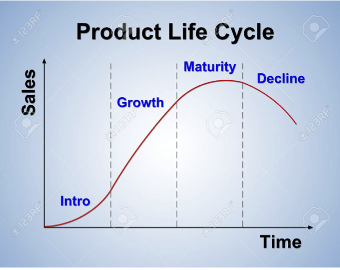
When planning for long-term maintenance of your project, it can be helpful to look at the principles behind long-term maintenance of a product. The product lifecycle is the natural process of conception and decline undergone by any product. It is made up of four stages:
- Introductory Stage:
- Also the “Market Development” stage; preliminary need of the user has been identified, but not proven demand exists
- Growth Stage
- This is the stage of highest growth; demand is high, size of market & competition expands rapidly
- Maturity Stage
- Demand levels off, product becomes dated
- Decline Stage
- The product becomes obsolete or maintenance is stopped
With these stages in mind, ask yourself the following questions:
| - How can you predict each stage of your project? - Think about your market: anything technology, for example, typically has quickly changing trends and faster life cycles. Medical devices or healthcare services are the opposite. |
| - How can you determine what stage you are in? |
| - How can you use this knowledge to change your strategy now? |
Your answers will inform how you choose to maintain your product or project over time, and will help you anticipate the natural rise and fall that will occur.
Part C: Automating the Maintenance of Your Dataset
A number of incredibly valuable research projects and compiled/cleaned datasets become useless over time because they are not routinely updated with the latest data. If your project required you to compile a dataset from publicly-available, regularly updated datasets (such as U.S. Census Bureau data), then consider automating your data’s year-to-year updates so it remains valuable for years to come. This is a straightforward process that any technical employee can do.
First, see the Data De-Identification Guidelines to ensure your dataset is de-identified and all confidential information removed. Next, go to the CHHS Open Data Portal. OpenGov.com, the host of the data portal, runs the site on an open-source data platform called CKAN which provides a FileStore API that enables automation of dataset updates. See Python documentation here.
Part D: Retrieving and Implementing User Feedback
Understanding iterative product development — or the the process of prototyping, delivering, assessing, and adjusting your output— is foundational to understanding product design principles. By continually asking for feedback and implementing changes, your product will continue to be tailored to the needs of your customer despite changing markets, attitudes, and trends.
Use the following framework to guide your feedback requests:
- Ask your customers about your product
- Categorize their feedback
- Act on their feedback
Step 1: Understanding overall trends in customer satisfaction over time
To identify trends in customer satisfaction, ask feedback at regular intervals, and track them over time. Some popular ways to measure overall customer satisfaction trends are:
- Net Promoter Score (NPS): A single question, answered with a scale of 1 to 10 “How likely are you to refer us as a product or service?”:
- Customer Satisfaction Score (CSAT) is a measurement of how satisfied a customer is with a specific interaction with a company: “Please rate the quality of service provided to you”
- Social media monitoring: use google tracking to keep up with what people are saying about your product or service
Step Two: Categorizing Customer Feedback
When it comes to organizing your feedback, it generally depends on the product or program you’re working on. Some common buckets are product and customer service:
- Product feedback:
- Major bugs/points of frustration. These are extremely urgent issues that prevent users from getting the core value out of your product.
- Minor bugs/points of frustration. These are minor issues that don’t distract from the core product value.
- Requests. Important to ask for feature requests, and prioritize them based on a mixture of volume of requests, potential impact of building that feature, and opportunity costs associated with each choice.
- Customer service feedback:
- Consider designing an automated survey if your product is digital and has some sort of customer assistance chat
- Include surveys after phone calls with customer service
Step Three: Act on Feedback
The most important part of getting feedback is actually acting on it — get your team together to brainstorm ways to meet the developing needs of the customer, and improve it in any way you can.
Below you can explore different data resources. Click on each heading to navigate to each section of resources.
Table of Contents
1. Internal CHHS Strategies and Guidelines
2. Goal Setting
3. Data Sources
4. Introductory Statistics Tools
5. Data Visualization (Beginner to Advanced)
6. Presenting your Data
Internal CHHS Strategies and Guidelines
If you are ever stuck, contact your Department’s data coordinator for information on how to find and exchange CHHS data.
- CHHS Information Strategic Plan
- CHHS Master Data Management Strategy
- CHHS Open Data Portal
- CHHS Open Data Handbook
- Data sharing materials:
- CHHS Data De-Identification Guidelines
- U.S. Digital Services Playbook
Goal Setting
- SMART Goal checklist
- lucidchart.com will help you create a use case diagram
- Visual Paradigm will also help you create a use case diagram
- For managers, Key Performance Indicators (KPIs) are also a great framework for measuring performance relative to your goals.
- Check out this resource to learn what they are, why they work, and how to set effective KPIs
- Data readiness: Harvard’s Strategic Use of Data Self-Assessment Guide offers a useful template.
- Analytics Capability Assessment for Human Service Agencies gives more specific data readiness guidance.
- Roadmap to Capacity Building in Analytics - This document is dense, but gives great insight into what you need to carry out a successful product.
Data Sources
Public data resources are available from a number of online sources, including the federal government and non-profit organizations. Following is a partial list of select data resources that can help contribute to data projects and analyses.
- USAFacts.org – A data-driven portrait of the American population, our government’s finances, and government’s impact on society that uses federal, state, and local data from over 70 sources.
- Healthdata.gov – Dedicated to making high value health data more accessible to entrepreneurs, researchers, and policy makers in the hopes of better health outcomes for all.
- CIA World Fact Book - Provides information on the history, people, government, economy, geography, communications, transportation, military, and transnational issues for 267 world entities.
- openFDA – Makes it easier to get access to publicly available FDA data. FDA’s goal is to make it simple for an application, mobile device, web developer, or researcher to use data from the FDA.
- Census Reporter – A Knight News Challenge-funded project to make it easier for journalists to write stories using information from the U.S. Census bureau. Place profiles and comparison pages provide a friendly interface for navigating data, including visualizations for a more useful first look.
- CalEnviro Screen - A mapping tool that helps identify California communities that are most affected by many sources of pollution, and where people are often especially vulnerable to pollution’s effects.
- California Healthy Places Index - A tool to explore community conditions that predict life expectancy. It contains user-friendly mapping and data resources at the census tract level across California.
- CHHS Open Data Portal - Offers access to standardized data that can be easily retrieved, combined, downloaded, sorted, searched, analyzed, redistributed and re-used by individuals, business, researchers, journalists, developers, and government to process, trend, and innovate.
Introductory Statistics Tools
Here are some key concepts and help integrating them into Excel
- Central Tendency
- Correlation
- Paired t-test
- Regression Analysis
- Multiple Regression in Excel
- Statistical Significance
Data Visualization (Beginner to Advanced)
If you just need a quick chart or table, check out these online tools — they are simpler to use than the advanced data visualization guides and may be more appropriate for your specific project:
- Google Charts (interactive charts & simple data tools)
- DataWrapper (charts, tables, and maps)
- Infogram (beginner-friendly, collaborative, focuses on design thinking principles)
More sophisticated guides are listed below:
- Beginner: databasic.io – A suite of easy-to-use web tools for beginners that introduce concepts of working with data. These simple tools make it easy to work with data in fun ways, so you can learn how to find great stories to tell.
- Beginner: This article summarizing general Data Visualization strategies and common methods used in different professions and sectors.
- Beginner: Tableau’s Data Visualization for Beginners: a Definition & Learning Guide with helpful examples
- Beginner: This Step-by-Step Guide to Data Visualization and Design written for beginners
- Beginner-Intermediate: Kaggle’s Data Visualization Course teaches you how to implement some more basic, powerful data visualization techniques (line charts, scatter plots, and distributions) and how to choose the right one.
- Intermediate:Vega – A visualization grammar, a declarative language for creating, saving, and sharing interactive visualization designs. With Vega, you can describe the visual appearance and interactive behavior of a visualization in a JSON format and generate web-based views using Canvas or SVG.
- Intermediate-Advanced: The Data Visualization Catalogue has a comprehensive list of charts that are separated by what data visualization function they employ.
- Advanced: D3.js – Data-Driven Documents D3 is a JavaScript library for manipulating documents based on data. D3 helps you bring data to life using HTML, SVG, and CSS. D3’s emphasis on web standards gives you the full capabilities of modern browsers without tying yourself to a proprietary framework, combining powerful visualization components and a data-driven approach to DOM manipulation.
- All levels: Coursera often has free online Data Visualization Courses — check to see if one is available!
Presenting your Data
- Color Contrast Grid – Test many foreground and background color combos for compliance with WCAG 2.0 minimum contrast.
- Use a word editing app like Hemingway to improve the readability of your writing. Hemingway will highlight lengthy or run-on sentences, remove overly dense writing, offer alternatives for weak adverbs and phrases as well as poor formatting choices.
- Visualize your story with a storyboard (see MIT’s guide to finding a story in your data)